Today I’m reviewing a website home page, pointing out potential improvements and then rebuilding a more effective home page that addresses some of the pain points.
The goal of this exercise is to give you an example that will help you craft a more effective home page for your own website. One that:
- Passes the 5-second test by immediately telling visitors exactly what you offer.
- Gives prospects the information they need to buy from you.
- Tells them exactly what to do next.
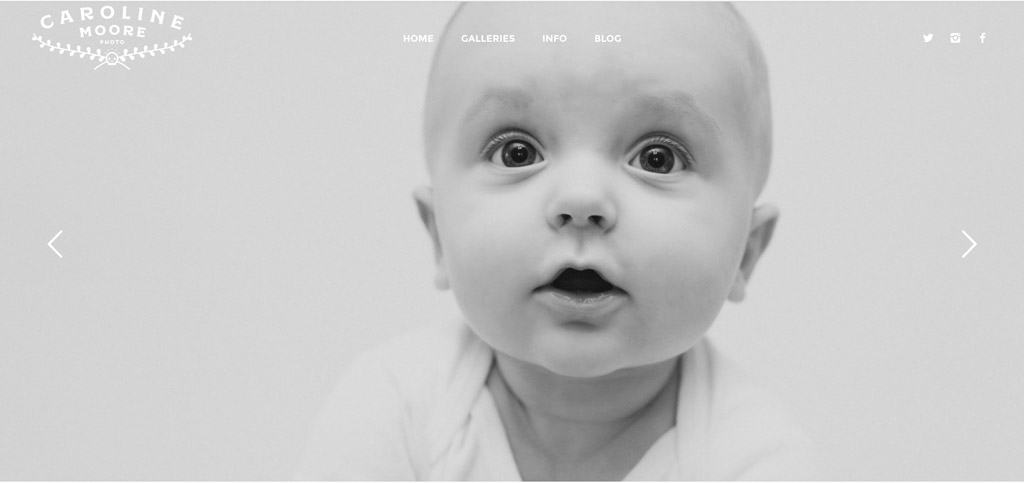
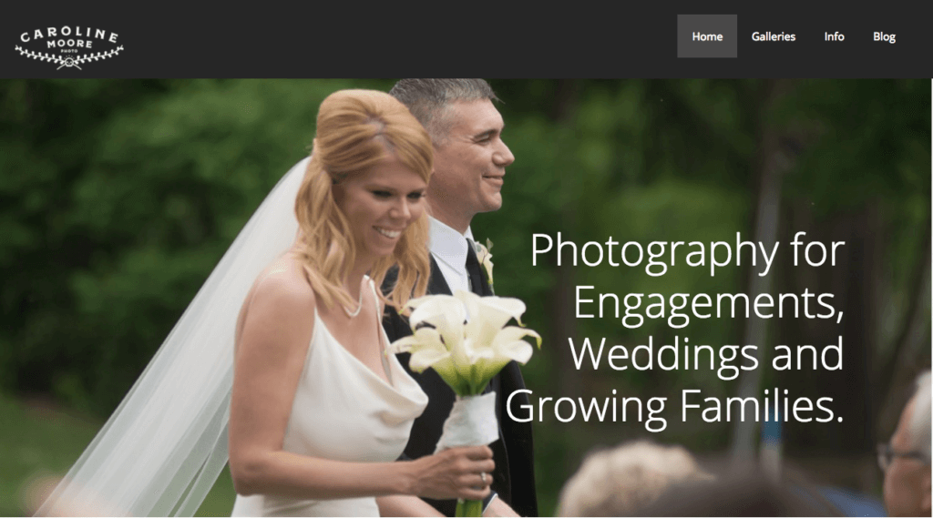
Our brave volunteer for this experiment is wedding photographer Caroline Moore of mooreclick.com. If you’re in the Pittsburgh area, definitely check her out for your wedding, engagement and new baby photo needs.
Crafting a Good Home Page for Your Own Business is Hard
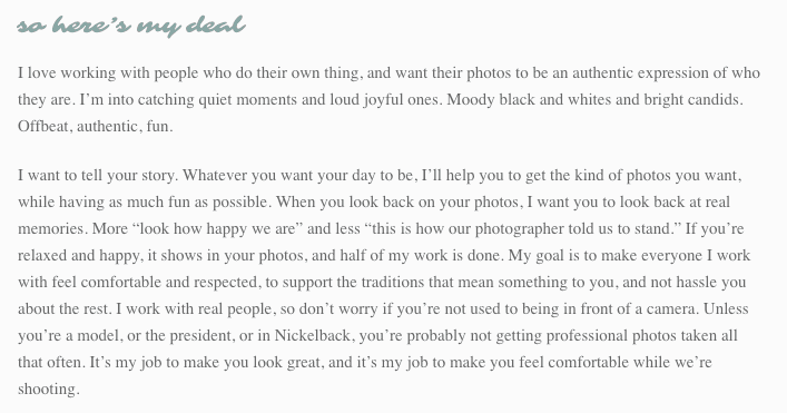
When we look at other people's websites and offers, it's easy to tell if it something that resonates with us. But when it comes to our own businesses, we're just too close. One of the biggest challenges we help our clients overcome is understanding that your website isn't actually FOR you. If you create a site that is based on your customers needs, you'll reap the rewards in more leads and customers.
Check out the video above to see an overview of some very common mistakes and watch as I rebuild a prototype of the page in about 15 minutes. Be sure to download the cheat sheet below for making sure your home page has the 7 basic elements of an effective home page that will help convert more of your visitors.
1. Slow Loading Home Page
I clocked the home page loading at 17 seconds, an eternity in internet time. You’ve got about 3 seconds before people get bored and leave your site and Google uses website speed as a factor in ranking sites in search results. You should do everything you can to keep your site lean and loading quickly.
- You can get your site speed grade from Google Page Speed Insights
- For photography based sites, it’s especially important to make sure those big, beautiful photos are optimized at the smallest possible file size while still maintaining quality.
- The Compress JPEG & PNG images or Imsanity are both great tools for making sure your images are optimized during upload to your site.
- Hosting plays a big role in speed as well, so make sure your host doesn’t suck. Flywheel (affiliate link) is a WordPress specific host that does a lot to make sites as fast as it can be.
2. Poor Contrast
 The text of the menu is mostly invisible because of the poor contrast between the text and the photos. The fact that there are multiple photos would make it hard to choose a single text color that works with all of them. Yes, the photos are important especially on a photography site, but make sure people can actually read the text!
3. Logo
![]() In the logo, Caroline’s name is the centerpiece of the logo, while the word ‘photo’ (what she actually does) is tiny. Emphasizing the core offering in her logo would help people to know they’re in the right place.
In the logo, Caroline’s name is the centerpiece of the logo, while the word ‘photo’ (what she actually does) is tiny. Emphasizing the core offering in her logo would help people to know they’re in the right place.
4. Give Your Images Meaningful Names
The logo file is named ‘skullslogo.png’ which has no relation to the business or the business owner. Technology has come a long way but search engine bots still can’t see images. Give your images meaningful names and give yourself more chances to come up in a search.
5. Headline
There’s no headline at all on the home page which is a major problem. A big, bold headline should help summarize your value proposition and entice people to stick around and learn more. Not having one means people are left to wonder what exactly is going on and what’s in it for them.
6. Sliders Make Your Website Suck
There is a multitude of data about why sliders are ineffective and decrease conversions, and plenty of people have written about it, including Thrive Themes, Yoast and my personal favorite, shouldiuseacarousel.com
7. Wall of (Tiny) Text
I’ve never written my personal list of website pet peeves, but if I did, this would be in the top three. The text is a huge part of communicating your message, so MAKE IT READABLE DAMMIT.
Here’s a test you can do to see if your website text might be too small. If you’re at your desk, push your chair an arm’s length away from the desk or table. If you can no longer easily read it, then you’ve got a problem.
A good rule is nothing smaller than 16 pixels and 18 is probably better.
[Tweet “Does your homepage have these 7 conversion-boosting elements?”]
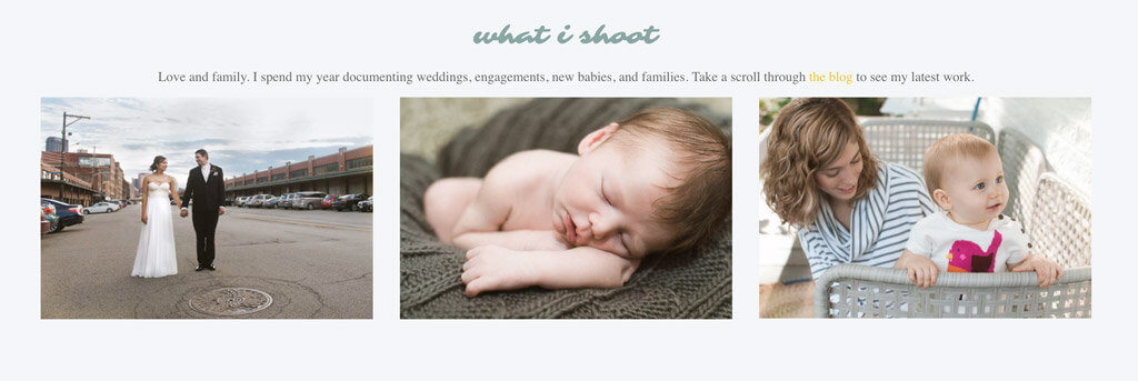
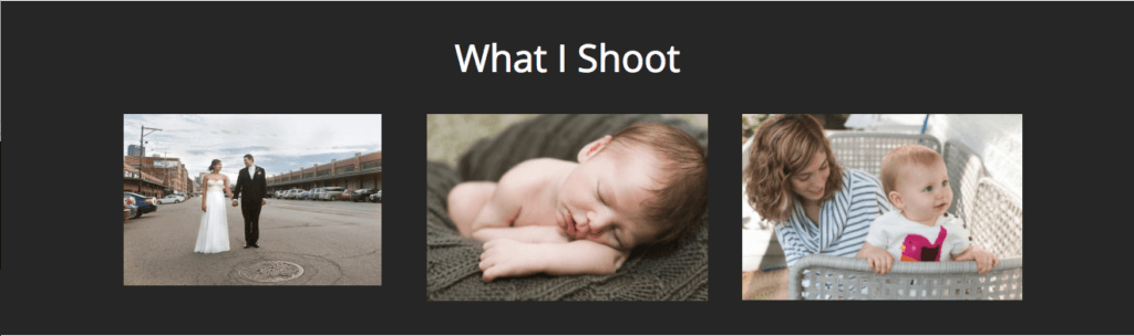
8. Showing Work
It’s not all bad news! The site does a great job of showing off the images, which is a huge factor in getting someone interested enough to contact you.
9. Testimonials
The home page contains several testimonials which is a great aspect of the page. There are few things more valuable and useful in increasing conversions than having other people say great things about you. However, the testimonials are in a fast moving slider, which makes them hard to read.
Testimonials are great, but highly targeted testimonials in the right place at the right time are better. But it can be tedious to actually get good feedback from your customers. Check out this Thrive Themes article to learn how to put your testimonials on autopilot.
10. This Feature Came with the Theme
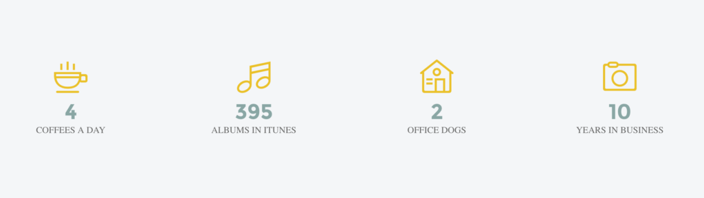
This weird list of random fact seems completely out of place. It could be scrapped, or edited to focus on metrics that would be relevant to your potential clients, such as how many weddings she’s photographed.
11. Call to Action (CTA)
Another A+ for having a contact form on the home page for people to immediately get in touch. Getting people to inquire is the main goal of the page. Many people spend all their space talking about how great their product or service is and never get around to asking their users to take action! Kudos for not missing this important step.
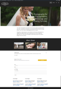
Part 2: Home Page Makeover
Now let’s see how we can rebuild this page to address the issues noted above.
Single Image Header with Big Bold Headline
In pouring though the tiny text on the home page, I found a pretty good headline. One thing that really helps with nailing this is be really clear on who exactly you’re trying to serve. The more you can narrow your audience, the easier it is to talk to them in a way that resonates and draws them towards you.
[Tweet “Clearly defining your audience will help you get better leads to your website.”]
Thrive Themes has a great post on getting better leads by narrowing your audience.
Identify the Problem and Your Unique Value Proposition
I used a couple of simple paragraphs with large easily readable text to narrow down on the core issues. You can see those in the full version at the end of the post. For the rest of the page, didn’t change much aside from putting the photos on a dark background to make them pop.
Testimonials and Calls to Action
These were already in place, so I didn't change much aside from adding the CTA immediately after the testimonial.
Click the image below to see a full size image of the improved version.
 Resources
There are several tools I use to help supercharge my online marketing efforts:
- GeneratePress is a theme framework that is lightweight, mobile-first and easy to customize without coding. Upgrade to the Pro version for $39 for even more control.
- Beaver Builder (affiliate link) is one of the best paige builders on the market. It’s easy to learn, works with almost any theme and most importantly, doesn’t leave a mess of short codes if you decide to turn it off.
- Thrive Themes (affiliate link) has all my go-to marketing focused WordPress tools. Thrive Ovation is what I use to capture testimonials and display them automatically in the right place at the right time.
- Calendly is my online calendar that syncs with my schedule and allows people to make appointments without the back and forth emails.
If you need help turning your website into a growth engine that brings you more customers, apply for a free strategy session.
